Website Designing

Wednesday 14 December 2011

Build and delpoy Web Forms faster. Adobe Business Catalyst.

Web Design Trends in 2012


It’s that time of year again, where we look into our crystal ball to see what will be the hot trends in web design for the upcoming year. It’s no secret that trends come and go, with some hanging around longer than they should. (Yes, splash page, I’m talking about you.) But trends are a necessity in the development and growth of our craft. Trends are born, improved upon, and often spawn other trends. So as a web designer, when you apply trends to your projects, challenge yourself to expand upon them and make them your own.
As you read this article, keep in mind that the shift in trends from one year to the next may be subtle, and you will probably recognize some of these trends already. But it’s our estimation that the concepts we mention below will grow and become even bigger in 2012.

1. Responsive Web Design

I believe eventually, we’ll all stop talking about responsive web design – not because it will go away, but because it will become what’s expected. However, I don’t think this will happen in 2012. It’s still too new of a concept, and there are many web designers that are not familiar with it at all.
320 and up boilerplate - responsive design
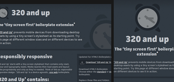
The continued introduction and adoption of more an more mobile devices is what will make 2012 the year of the responsive web site. Web designers and developers will move to the use of fluid layouts instead fixed width, and media queries will find they’re way into many more stylesheets – allowing more sites to easily be viewed across multiple screens sizes and devices.

2. Fixed-Position Navigation

We have all run into this technique at some point, mostly on personal websites or individual blogs. I have seen a large drop in this trend during 2010-2011, but a resurgence has been appearing over the last few months.
If your website doesn’t have a lot of main navigation then you only need to provide a few small links. So why not keep these visible to each user at all times? This can dramatically improve website performance and even blend into the overall page layout with ease. The concept idea is to keep the navbar and internal links/logo locked in place as your visitors scroll through the content.
Ryan Scherf main portfolio page
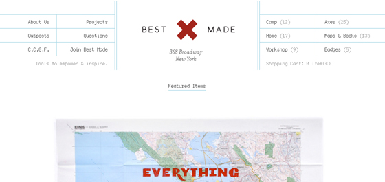
jQuery has allowed for very rapid prototyping of this effect. And even without JavaScript enabled you can apply some fancy CSS code to replicate the sticky nav effect. Most of the static navigation bars in 2011 have followed the user’s movement around from page to page. Yet in the example below Simon Wuyts has taken fixed navigation into a new level.
net onwerp web design - fixed position menu
You never consider keeping your webpage content set into a slideshow-like panel for easy display. Not only does this remove the worry of screen resolution, but the navigation system is easy to work with and carries over nicely into mobile browsers. You may seriously consider this technique and all the major benefits during a 2012 site layout re-design.
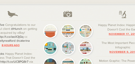
3. Circles

This trend has actually been noticeable in web design for a bit, yet it recently had died down to lay low for a couple years. During the web 2.0 boom designers were focusing more on desktop-based trends such as drop shadows and rounded corners. But with CSS3 it’s now easier than ever to create these fancy box effects.
Additionally you can design circles and shapes without the need for any images. The impact of these features has caused designers to look at photos in another light entirely. I constantly check out portfolios for web designers and have noticed a dramatic increase in circular-shaped elements. These archetypes can be setup as navigation links, footer icons, or even displaying important portfolio works as seen below.
Mickael Larcheveque personal portfolio website
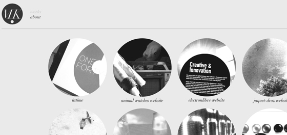
But the most extreme examples aren’t always the best. Circular shapes are smooth and encourage eye contact from your visitors. Use these to single out specific areas in your design such as listings to helpful resources and pages. Just the shape itself is pleasing enough to be dropped into the background and still hold a delightful effect.
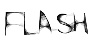
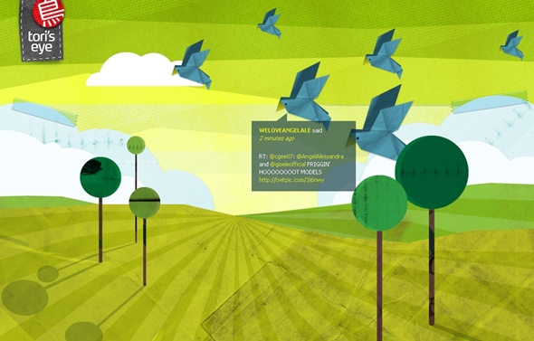
Column Five Media footer area

4. Big Vector Art

The goofy oversized mascots you can spot throughout websites have begun to claim a brand of their own. Just a few years ago you could not find very much illustration work tied into web branding. But the quality of individual designer’s talent has improved greatly. And I can think of no better marketing brand than a lovable vector-based creature.
mailman vector art for Thunderbird software
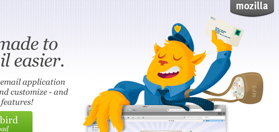
The many faces attributed to Mozilla and Firefox are just the tip of the iceberg. MailChimp is another great example which has set the bar higher than ever before. The infamous mailman monkey is featured all throughout the website and also throughout their iOS and Android apps.
Freelance Switch freelancers design blog
Additionally the small businessman found throughout Freelance Switch really sticks in my mind. There are a slew of unique vector dudes to be found in their layout. This kind of practice has adapted into a whole new realm of website aesthetics. And if the year 2011 has shown anything it’s that 2012 will be chock-full of these adorable vector logos!

5. Multi-Column Menus

Contrary to our previous example, there are times when a website consists of way too many links to handle. Reasonably the standard type of navigation gets too messy and congested unless you move links into the sidebar. But user experience testing has shown very good results in keeping core links towards the top of pages.
Neuarmy multi-column nav menu
This new year of trends offers designers a new chance at rebuilding. Ideas are often so black and white, but there is a whole realm of creativity waiting to be tapped into. Multi-column layouts are elegantly brilliant in their own regard. You can easily display numerous links to your visitors and keep this section fitted squarely around your logo.
Best Made Company home webpage
The best way to get comfortable with this style is practice. Check out some recent articles on the topic to educate yourself about trends in web navigation. Designers are eagerly jumping into the testing arena with new ideas every year. Clearly the reform of standard navigation is a big one on everybody’s plate.

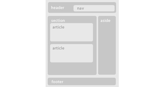
6. jQuery/CSS3/HTML5 Animation

I have always recommended jQuery effects when applied in small portions. Web design must encompass the whole user experience as well as fancy aesthetics and bonus animations. Luckily advances in the jQuery library as well as CSS3 specifications allow for some really outstanding effects with much fewer lines of code than ever before.
In just this past year alone I have run into some educational tutorials to be found all over the web. jQuery is the master of frontend browser effects but unfortunately doesn’t boast 100% major support. Thus using a fallback method tied into CSS means your website is compatible with mostly all visitors and still provides an exceptional experience. I can only imagine what developers are planning for new ideas to roll out as we move closer into 2012.

7. Ribbons & Banner Graphics

This is one design element which I had begun noticing a lot more in 2011. Designers began to write simplified tutorials for creating page ribbons, banners, bookmarks, or other types of display badges. Because of the massive emergence of free information more designers have begun jumping into the trends, too.
Letter Learner App for iPhone and iPad
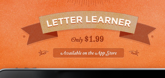
You would be surprised how many websites have included this style of design in just 6 short months. Beta testers often use these ribbons to classify the current release version of software and mobile apps. Additionally you’ll find banners wrapped around free downloads or featured articles in blogs. I’ve collected a few of my favorite ribbon PSD downloads below, so check them out and be sure to keep your eyes peeled for additional freebies in the coming months.

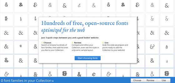
8. Custom Font Faces

The free online font library Typekit provides a free trial for any interested web designers. With this tool you embed a bit of JavaScript which allows you to write any custom font into CSS styles. In 2011 this trend has shot up in popularity, especially among WordPress designers trying to keep their blogs unique from the rest.
Typekit was however a buggy system with very little support up until a few years ago. Now Google Web Fonts has been giving them a run for their money, and it appears to be more popular than ever! You simply go through a library of supported fonts and Google will output the code you need to include. Then you simply reference each font by name when declaring CSS font-family properties on an HTML element.
Google Web Fonts - Dynamic CSS Typography
What I find so exciting about this trend is how recently it has shot into the mainstream. It seems now even developers are creating free plugins to make custom fonts just that much easier to install. There is no uploading of fonts required, no stress involved and very little to go wrong. Bloggers should take notice of this and check out some of the alternative fonts available to them.

9. Infographics

This trend certainly doesn’t affect the overall web design, but as for user experience and content presentation infographics have blown the roof off new-age media. Never before has information been presented in such an easy-to-consume manner. Even if you barely understand the topic most infographics provide data, charts, and supporting imagery so that a 5 year old child could follow along.
Instagram infographic fun facts
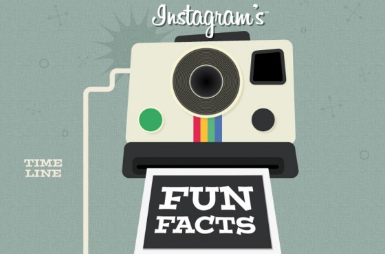
Depending on the type of website you may find this trend not all too useful. It can take a lot of practice and time spent slaving away in Photoshop to perfect these works of art. Yet if you have the talent ordrive to teach yourself I say go for it! Now more than ever before the Internet has become a place we can all gather and share information. Infographics have expedited this process using the World Wide Web as a presentation medium.

10. Focus on Simplicity

Ultimately the goal of any website is to get your visitors from point A to B as quickly as possible. Simple, intuitive interfaces are the way of our future. In just the past 5 years I have noticed most of the popular design trends stemming from minimalism. This idea is not ill-founded, as the lesser number of page elements to distract visitors will naturally keep them focused on their goal(s).
We can provide so many examples of this, and there are so many areas to cover. Earlier this May we covered a fine gallery of minimalist websites which pose as examples to perfection. Depending on the type of website you have there may be too many required interface pieces to coordinate a simplistic overtone.
Evening sunset over Japanese Houses
But to rearrange a layout into a clean setup doesn’t require minimalism at the heart of it all. Spend some time writing and drafting out ideas for your navigation, page hierarchy, headings, content area etc. I find that a little bit of pre-planning can go a long way towards simplifying everything.

Conclusion

These design trends are just some of the few to keep up with as we move forwards into 2012. The year is unpredictable and nobody can say for sure what to expect. I think the facts are obvious that your average web designer has been learning much quicker in recent years than ever before in history. As such we could only expect plenty of innovation and new semantics ushering us into a golden age of technology and massive Internet awareness.

Jake Rocheleau is a social media enthusiast and Internet entrepreneur. He can be followed on twitter - @jakerocheleau His presence on the web can be found atJakeRocheleau.com.

Web Design Trends in 2011

Tuesday 13 December 2011

HTML5 Essentials and Good Practices

Powerful Web Forms. Zero Coding. Adobe Business Catalyst.


HTML5, together with CSS3 and responsive design are the new buzz around web technologies these days. This article will help you get started using HTML5 on your projects today and show you some good practices to put what you learned to good use.

HTML5 Logo
Lets see a typical HTML5 page markup:
<!doctype html>
<html>
<head>
   <title></title>
</head>
<body>
   <header>
       <h1></h1>
       <nav>
           <ul>
               <li><a href="#">link 1</a></li>
               <li><a href="#">link 2</a></li>
               <li><a href="#">link 3</a></li>
           </ul>
       </nav>
   </header>

   <section>
       <article>
           <hgroup>
               <h1>Post title</h1>
               <h2>Subtitle and info</h2>
           </hgroup>
           <p>Content goes here.</p>
       </article>
       <article>
           <!-- Another article here -->
       </article>
   </section>
   <aside>
       <!-- Sidebar here -->
   </aside>
   <footer></footer>
</body>
</html>
With some styling the structure of our page will be like the image below
HTML5 Logo

Doctype

If you come from an HTML 4 or XHTML background, the first thing you might have noticed on the sample markup above, is the new doctype declaration. Really simple, just type it as you see it. And no reasons to worry, it is backwards compatible with all browsers. You can actually change it right now on all your html pages.
Apart from the new simple doctype declaration, you will see many new tags. Most of them are pretty much self explanatory but lets see them in detail.

Block level Elements

In HTML5 we no longer have to resort to “div-itis” to give structure to our page. We have a great selection of new block level elements that help us to create a semantic structure quickly and of course our code becomes more readable and maintainable.
With the new structural elements we can begin to forget about <div id=”header”> and <div id=”footer”> and start using the new <header> and <footer> tags. They work the same as a div but hey, less writing, more semantic code. We are also introduced to other new elements such as <section> <article> <nav> <aside> <hgroup> <figure> and <figcaption>.
The use of <header> and <footer> is obvious. The <nav> tag specifies the navigation links of our page instead of having <div id=”navigation”>. <aside> refers to a section of the page that is separated from the main content. It is mostly used for sidebars today, though some developers suggest it could be used to contain some secondary information for example, for articles.
<section> is used to give structure to our page and contain parts related to a certain theme while <article> can contain a blog post, news post, comment etc. A <section> can contain many <article> elements and an <article> element can contain many <section> elements.
We also have a new container for our headings <h1> to <h6> which is the <hgroup>. Finally we have a <figure> element which is container for a representational image, related to the content but its presence is not mandatory. The <figure> element can also contain a caption using the <figcaption> element.

Inline Elements

HTML5 introduces some new inline elements too. <time> and <mark> are a couple of these new ones that help to make our markup even more semantic.
<time> is used to display time semantically. You can choose to display time, date and both. Example below
<time datetime=”20:00”>8pm</time>
<mark> is used to highlight parts of content for example when a user searches for a specific term. Its difference from <strong> or <em> is that it gives no special meaning or importance to the content it highlights.

Media Elements

HTML5 also brings us some new media elements. We have <audio>, <video> and <embed> tags together with the <source> tag to specify media sources. The simplest way to use them is below
<!-- simple audio use -->
<audio src="audio-file.ogg" controls>
</audio>

<!-- simple video use with multiple sources-->
<video controls>
   <source src="video-file.mp4" type="video/mp4"/>
   <source src="video-file.ogv" type="video/ogg"/>
</video>
Unfortunately, support is not so great yet. Browser makers chose different filetypes and encoding for the sources they support so you have to use multiple versions of the same media with different encoding and you need a flash fallback to support even older browsers.

Canvas Element

One of the other great new features HTML5 has to offer, is the <canvas> element. It gives you the ability to draw shapes dynamically or even manipulate images. <canvas> by itself provides vast possibilities in modern web design and development but it is not a matter to discuss in this article.

Good Practices

With all those new elements some people are bound to get confused. Should we use a header inside an article to contain all the title info? Should we wrap every heading with an <hgroup>? To help you out, here are some good practices about these new elements.
The less is more motto stands in HTML5 markup too. For example when you have a single <h1> heading in your <article>, there is no need to wrap it with an <hgroup> tag. If you have two or more headings, then wrapping both of them with an <hgroup> would be a good use of the <hgroup> element.
<!-- incorrect use of hgroup -->
<article>
    <hgroup>
        <h1>Heading</h1>
    </hgroup>
    <!-- rest of content here -->
</article>

<!-- correct use of hgroup -->
<article>
    <hgroup>
        <h1>Heading 1</h1>
        <h2>Heading 2</h2>
        <h3>Heading 3</h3>
    </hgroup>
    <!-- rest of content here -->
</article>
Do you really need to have a <header> and a <footer> element on your <article>? Depends. Do you have many info regarding the article like multiple headings, date information, comment information etc? Then the <header> would have semantic meaning and would be used correctly. Again refrain in using too many elements when they are really not needed. No need to nest a single <h1> in a <header>. Same goes for the <footer> element. Do you have post information, author information etc? Then a <footer> would be appropriate.
<!-- incorrect use of header -->
<article>
    <header>
        <h1>Heading</h1>
    </header>
    <!-- rest of content here -->
</article>

<!-- correct use of header -->
<article>
    <header>
        <hgroup>
            <h1>Heading 1</h1>
            <h2>Heading 2</h2>
        </hgroup>
        <p>Date and Author information</p>
    </header>
    <!-- rest of content here -->
</article>
Should you use <section> or <article>? There really is only one way to tell whether you should use one of these elements. <section> refers to a structure that contains related content. <article> on the other side, contains independent content. So a <section> can have many <article>s and an <article> can have many <section>s. It all gets down to what the content is.
Do you use <aside> only for a sidebar structure? <aside> started out that way, but the specs have changed since then. Nowadays <aside> gets another semantic meaning when used inside an <article>. It denotes secondary content related of course to the main content inside the <article>. When used outside of an <article> it is still considered secondary content but for the page as a whole, sidebars being a perfect example.
<!-- aside outside of article -->
<div>
    <aside>
        <!-- use as sidebar for example -->
    </aside>
</div>

<!-- aside inside of article -->
<article>
    <!-- main article content here -->
    <aside>
        <!-- secondary related content -->
    </aside>
</article>

Browser support

Support is great for most of the new HTML5 tags, especially the block level ones. All you have to do to enable all the modern browsers to understand them, is to include the code below in you css file.
article, aside, figcaption, figure, footer, header, hgroup, nav, section
{
    display: block;
}
For IE, this is, of course, not enough. Still all you need to do, is include the html5shiv script when the page load in IE. Use the code below
<!--[if lt IE 9]>
<script src="http://html5shiv.googlecode.com/svn/trunk/html5.js"></script>
<![endif]-->
And that’s pretty much it. You can start using these new HTML5 elements today and make your markup much more semantic, readable and maintainable.

About the Author


Ilias Iovis is a web and graphics designer & web developer from Thessaloniki, Greece. He is mostly interested in front-end and is constantly learning about HTML5, CSS3 and jQuery. You can find him at iliasiovis.comand follow him on @iliasiovis.

Web Design Trends in 2011

Monday 12 December 2011

Web Design Trends in 2011
Create a Portfolio for your Pocket with Business Cards from moo.com
How will you stay relevant as a designer in 2011? The ultimate goal of a designer is not to dazzle but to entangle. Any designer can get ‘oohs’ and ‘ahhs’ that are easily forgotten. The supreme designer is able to create an environment which charms and captivates the user to the point where he does not want to find the ‘Back’ button. Several elements come together to forge such a wonderland: harmonious color scheme, intuitive design, easily accessible information and fast response. Additionally, one can never under-estimate the power of simplicity. Of course, this has always been the case, but in 2011, you are no longer at the forgiving discretion of the desktop, or even laptop, computer. Now, your design must contend with smart phones, netbooks, tablets and the like. Are you ready?
Take a gander at the top 11 trends for 2011.

1. More CSS3 + HTML5

What a gratifying sigh of relief! CSS3 and HTML5 have been on the distant horizon of web design for the past couple of years, but now, in 2011, we see an explosion of it. Designers are finally starting to let go of Flash. However you may feel about Flash, you do know that it does not play well with some of the hot, new technology available to your current and potential visitors. In 2011, you will slowly step away from Flash and embrace the magic known as HTML5. Look at the amazingly similar comparison:
Now that’s shown, please understand that Flash and HTML5 are not equal opponents. There is plenty of room for both in 2011. The problem is that designers in 2010 (and before) misused Flash. Case in point, very rarely should your entire site be made of Flash, especially these days. HTML5 alleviates some of the burden we have placed on Flash. However, HTML5 cannot (yet) replace the extraordinary design elements we can achieve through Flash.
Perhaps even more exciting is the fact that CSS3 is available to us in a real way this year. Move over Photoshop (wow, Adobe just cannot rest), because CSS3 is making short work of text shadow, border radius and image transparency. If you have not already begun, now is the time to really delve into understanding CSS3 and HTML5.

2. Simple Color Schemes

Simplicity. There’s nothing quite as impacting as an honest message on a quiet backdrop. Quiet can be interpreted several different ways. Forget black and white or shades of gray. Think of green, yellow or even red as your primary color. However, limit your palette to two or three colors. Work within the shades of each color for variety. It can be truly remarkable what a few colors can do for your message. Observe:
Shades of green create this Twitter visualization tool. Side note: this site was created with XHTML/CSS and Javascript.
Red can be jarring if done incorrectly. This site gets it right by subduing the color’s overwhelming personality with easy-to-read high contrast text.
Jacqueline is an artist and a writer who spends an inordinate amount of time playing Super Nintendo and watching Star Trek. 


Google’s "Panda" SEO Effects - DotTechnologies

Thursday 8 December 2011

The Google Panda Update will affect your Google Search Results Page Ranking.
As many of you have heard by now Google has dramatically changed how it ranks pages in its search results in an update they have dubbed Panda. The primary goal of the Panda update was to give user the best, most relevant possible results. The side effect is that many sites that were in a coveted top position for their keywords, are now finding themselves scrambling to reclaim their place at the top of the mountain.

The Panda update places an emphasis on "quality content". Google takes into account factors such as the amount of time people spend on the site and how many pages within the website they visit. It also favors sites that have a presence in social media and maintain frequently updated content (such as blog). While it’s arguable that this is all for the best, as it will "undoubtedly" mean better more relevant results, its overlooking some very basic facts:

* Small Business owners don't have the time to constantly update their content.

* Some websites are designed specifically so that people don't have to spend a lot of time on them to find   what they need and have that need serviced.

* Businesses that developed a large website before content management systems became the norm and that contain a lot of static content do not have the time or money to invest in adjusting or redeveloping their design or content. Yet these sites are still relevant to the audience they address.

 * Small businesses with a 5 page site that is optimized for SEO and relevant will not be able to compete with a less relevant competitor that has a blog and may not have the time or money to invest in blogging but instead invest in quality products and services.

It is difficult for the small business owner to adapt to these changes, since some of them represent a financial barrier or require them to rethink the entire design and development behind a site that has been working well for them up to this point.

The following are a few ways that small business owners can try to overcome the difficulties presented by the Panda Update based on their situation:

 * Prioritize your most important 5 pages and redevelop the content of those pages first. QWebDesign.com can offer assistance with this task.

  * Start PPC Advertising in Google. If you've lost ground organically you can try to make up for it in paid search. Also this may increase your traffic which will also help you organically. Use the Site links Extension in Ad words to get more out of your budget and direct people to other relevant pages of your site.

QWEBDESIGN.COM has a team of experts that can advise you on how to setup a PPC campaign or modify an existing one.

    * Eliminate duplicate content and/or "boilerplate" content from your web pages

    * Redirect your weakest pages to stronger more relevant pages.

    * Redevelop your entire website design based on a comprehensive Inbound Marketing
Strategy and once its complete redirect all of your old pages to the new site and content. Use content management systems such as Joomla and Wordpress to make it easier to manage, edit, update, and market. QWEBDESIGN.COM's staff can help you not only setup these content management systems but we can also give you tips on how to best use them.

For some businesses, implementing a blog or social media presences will require time and effort in terms of developing an appropriate strategy (assuming their policy or stance allows for it at all). However taking the leap and starting a Social Media Strategy will help improve your overall SEO efforts since Social Media will aid the following components of a good SEO strategy:

    * External Link Building

    * Increased Traffic

    * Relevant Anchor Text on External Links

    * Real-time Content

    * Frequency of Updated Content

Using the methods mentioned above are sure to help you reclaim some of your lost search engine ranking and in time likely return you to your previous position or better. For new sites, focusing on these criteria will help ensure your success. Again, if you're uncomfortable implementing these kinds of changes on your own, or this type of web design overhaul is simply a time consuming of a task, feel free to contact QWebDesign.com and ask for our web design team to help tackle it for you.

How Magento modules can improve your ecommerce website - DotTechnologies

Wednesday 7 December 2011

Magento is described by many web design experts as the best piece of ecommerce software available to shops and stores looking to take their business online. It allows you to build an SEO friendly ecommerce website that is compatible with tools like Google Analytics and Google Adwords. As well as having functionalities that allow customers to filter their products and see your best selling products first, Magento also provides sales data, and other customer and product based reports, allowing you to evaluate your businesses performance, and have full control over your website. Like WordPress, which is known for having thousands of add-ons and plugins, there are a variety of different plugins, known as ‘modules’ available to integrate with your Magento website. These modules are designed to enhance your website, adapting it so it looks or functions in a different way.

These modules will make your ecommerce website run more smoothly, providing a better shopping experience for your customers. Whether you’re in the retail, manufacturing, or hospitality industry, there will be many suitable add-ons available for you to use to improve your websites functionality.

Some Magento modules are free and can be downloaded online, whereas others you have to pay for. Each has its own specific purpose and you will find some more useful than others, depending on what you are looking to do with your ecommerce site. Two popular free add-ons are the Enterprise Suit ERP and Sweet Tooth Rewards. The Enterprise Suite module provides businesses with information such as incoming orders and stock quantity. It also enables website owners to update prices and other product details more efficiently. Sweet Tooth Rewards is another fantastic free extension which creates a loyalty point system for a Magento website. Customers earn points by buying products regularly and can then use these points to purchase more products as they gain more and more. This is a great tool as it attracts new customers and keeps existing customers happy!

Although there are a number of free add-ons available, if you’re looking for something a little more advanced, or that does something specific for your website, you will have to purchase them. Prices vary depending on the type of module that you’re looking to buy. Magento Cybertill integration is a module that automatically fetches your stock levels and updates your website with the correct information, ensuring that your customers can’t purchase something that is out of stock. This is a useful tool as it allows you to see when you are getting low on particular items, and need to re-order them. With Cybertill there are a three ways in which you can integrate it with your Magento site, basic, advanced or completely, with the two latter options you will gain more benefits such as customers and sales integration and other simple object access protocol services.

There are also add-ons which ensure your ecommerce site produces suitable XML product feeds for Google Base, as well as tools that make updating information on your website much easier, such as the Magento Press Release module that allows you to create, control and publish press releases is a simple and efficient manner.

Magento Modules help to create a better shopping experience for customers, as they enhance your website and make it more user-friendly. As well as improving your website for customers, these add-ons help to provide you with knowledge and important information that could help you improve your business in the long run. Although there are a large number of modules on the market, all of which have different purposes, if you can’t quite find the right one for your site, web developing experts are able to make tailor-made ones, ensuring that you enhance your website to its full potential.

Pimp Your Photo – Over 20 Awesome and Free Photoshop Actions - DotTechnologies

Tuesday 6 December 2011

Today I want to share with you some of my favorite Photoshop actions. First of all, let me tell you a little about it: an action is a set of recorded commands which you can use on several photos to obtain a certain effect. These actions will help you add more light, sharpen or add some extra effects to your image, they’re absolutely great and they help you save a lot of time!

So if you have a series of dark photos and you want to make them brighter, or you have really dull colors on your photos and you really want to bring some life to those photos or other great effects that will make your photos stand out, check out the collection of Photoshop actions below, you will certainly find something you like:


  Photoshop Action 21 by ~miss-etikate


My first homemade action! Made from a tutorial I found online. Hope you guys like it.

Please favorite if you use it and I'd LOVE to see the results from this action!


Sample photo by me (Giżycko)

Rules
1. Fave me if you are going to download this Photoshop Action.
2. Don't copy as your own!
3. You can also inform me in the comments if you are going to download.
4. Give me link back if used.
5. Keep the rules.

Remeber, that actions look differently on each picture (;
Hope you like it


This action seems very nice, especially single, I fit all kinds of pictures .. I hope you like 


 Color Action by ~Amr-Mohseni hope you like it , image from stock images i have
please do not redistribute it , and favorite if you gone use it


Top