Eventually, we’ll all stop talking about responsive web design – not because it will go away, but because it will become what’s expected. Flashback ten years ago and we were all talking about CSS and tableless design, but today there’s no need to mention it. It’s simply the way modern websites are built, although sadly, I’m sure there’s a few out there still using tables.
Nevertheless, the concept of responsive web design is still relatively new. So it’s our job to help you learn about it and to help you find the stuff that makes building responsive sites easier. For this post we’ve gathered a collection of Responsive Web Design Templates and Frameworks.
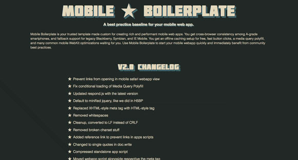
Mobile Boilerplate is your trusted template made custom for creating rich and performant mobile web apps. You get cross-browser consistency among A-grade smartphones, and fallback support for legacy Blackberry, Symbian, and IE Mobile.
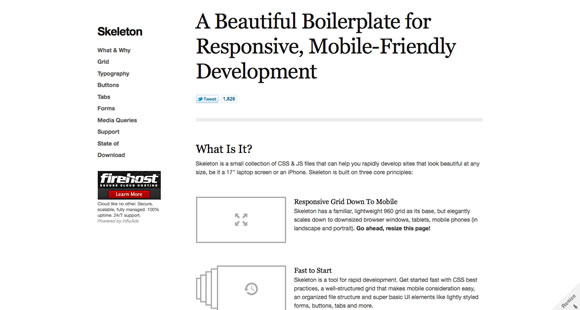
Skeleton is a small collection of CSS & JS files that can help you rapidly develop sites that look beautiful at any size, be it a 17″ laptop screen or an iPhone.
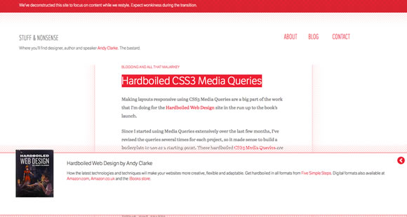
These hardboiled CSS3 Media Queries are empty placeholders for targeting the devices and attributes I’m interesting in making responsive designs for right now.
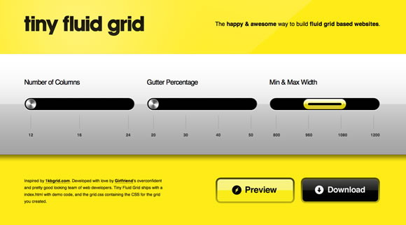
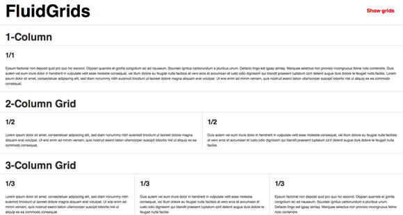
The happy & awesome way to build fluid grid based websites.
A CSS framework for rapid interactive prototyping.
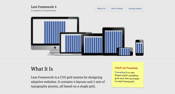
Less Framework is a CSS grid system for designing adaptive websites. It contains 4 layouts and 3 sets of typography presets, all based on a single grid.
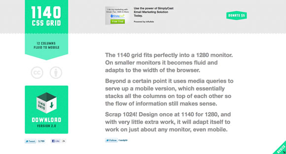
The 1140 grid fits perfectly into a 1280 monitor. On smaller monitors it becomes fluid and adapts to the width of the browser.
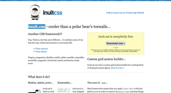
inuit.css is built to work on smaller screens (such as tablets) and tiny screens (such as phones) straight out of the box with minimal effort.
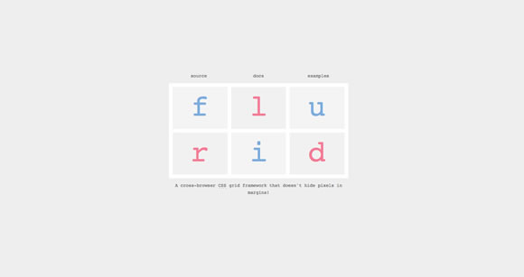
A cross-browser CSS grid framework that doesn’t hide pixels in margins!
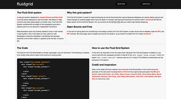
A web grid system designed by Joseph Silvashy and New Gold Leaf that allows designers to use the screen real estate on large monitors and retain great design on smaller ones.
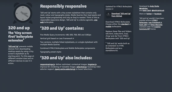
‘320 and Up’ prevents mobile devices from downloading desktop assets by using a tiny screen’s stylesheet as its starting point.


 Hitwiseannounced the top search terms of 2011. The company looked at the top 1,000 search queries of 2011 and found that Facebook topped the list for the third year in a row.
