Web Design Trends in 2011


inThere is a thin line between design and development, and as we move into a new decade, this line is becoming extremely blurry. Is it enough to draw beautiful mock ups in Photoshop? Maybe 5 years ago. These days, the average internet user requires more. All beauty, with no substance, gets boring after a while. If your only goal is to impress a community of fellow designers with your flashy designs, you’ll find yourself quickly beneath the tide. 2011 is not about beauty, it’s about function. The trends for this new year and emerging decade are responsive design, constant connection and virtual reality.
How will you stay relevant as a designer in 2011? The ultimate goal of a designer is not to dazzle but to entangle. Any designer can get ‘oohs’ and ‘ahhs’ that are easily forgotten. The supreme designer is able to create an environment which charms and captivates the user to the point where he does not want to find the ‘Back’ button. Several elements come together to forge such a wonderland: harmonious color scheme, intuitive design, easily accessible information and fast response. Additionally, one can never under-estimate the power of simplicity. Of course, this has always been the case, but in 2011, you are no longer at the forgiving discretion of the desktop, or even laptop, computer. Now, your design must contend with smart phones, netbooks, tablets and the like. Are you ready?
Take a gander at the top 11 trends for 2011.
1. More CSS3 + HTML5
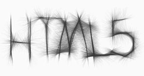
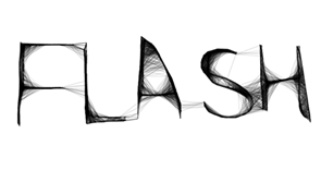
What a gratifying sigh of relief! CSS3 and HTML5 have been on the distant horizon of web design for the past couple of years, but now, in 2011, we see an explosion of it. Designers are finally starting to let go of Flash. However you may feel about Flash, you do know that it does not play well with some of the hot, new technology available to your current and potential visitors. In 2011, you will slowly step away from Flash and embrace the magic known as HTML5. Look at the amazingly similar comparison:
Now that’s shown, please understand that Flash and HTML5 are not equal opponents. There is plenty of room for both in 2011. The problem is that designers in 2010 (and before) misused Flash. Case in point, very rarely should your entire site be made of Flash, especially these days. HTML5 alleviates some of the burden we have placed on Flash. However, HTML5 cannot (yet) replace the extraordinary design elements we can achieve through Flash.
Perhaps even more exciting is the fact that CSS3 is available to us in a real way this year. Move over Photoshop (wow, Adobe just cannot rest), because CSS3 is making short work of text shadow, border radius and image transparency. If you have not already begun, now is the time to really delve into understanding CSS3 and HTML5.
2. Simple Color Schemes
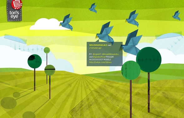
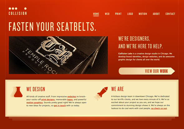
Simplicity. There’s nothing quite as impacting as an honest message on a quiet backdrop. Quiet can be interpreted several different ways. Forget black and white or shades of gray. Think of green, yellow or even red as your primary color. However, limit your palette to two or three colors. Work within the shades of each color for variety. It can be truly remarkable what a few colors can do for your message. Observe:
Shades of green create this Twitter visualization tool. Side note: this site was created with XHTML/CSS and Javascript.
Red can be jarring if done incorrectly. This site gets it right by subduing the color’s overwhelming personality with easy-to-read high contrast text.
Jacqueline is an artist and a writer who spends an inordinate amount of time playing Super Nintendo and watching Star Trek.
Thanks for the post. I liked it. Keep going I follow you.
ReplyDeletehtml5 player| html5 player