An SEO Playbook For 2012

Monday, 19 December 2011

"All Things SEO Sponsored by Covario"
2012 SEO PlaybookSearch Engine Optimization is growing up. I am not ready to say the Wild West SEO days are completely eradicated, but in 2011 good search engine optimization is less about trickery and more about engaging content and audience development than ever before.
Over the years, quality optimizers have become more prone to avoid technical tricks like using CSS image replacement to inject keyword text or controlling the flow of PageRank by hiding links from search engines.
Search engines keep getting better at crawling and indexing. If you are unwilling to burn your website or risk your career, you follow the search engines’ terms of service.
During 2011 the conservative attitude toward code crossed chasm to apply to content. For years, websites churned-out poorly written, generic articles in the name of long-tail keyword optimization. It worked so well some people turned crappy content into startups.
Now, thanks to Panda, Google’s site-wide penalty for having too much low quality content, people are asking why anyone would put pages on a website that no one wants to read, share or link to? Without taking potshots at the past, most of those articles look juvenile and antiquated.
Made in Japan went from signifying cheap to marvelous. Made for the Web is growing-up too. It is this evolution which guides my SEO highlights for 2012. I separate things to keep in mind by code, design and content.

Code – Keep It Simple

While Google likes to tell us they are very good at crawling and understanding imperfect code, I prefer to assume search engines are dumb and help them every way I can. Simple code is honest code. It’s also easy to parse and analyze. Just because you can AJAX-up a page with accordions and fly-outs does not mean you should. The more code on a page, the more things that can go wrong from spider access to browser compatibility.
Follow standards and get as close to validated markup as reasonably possible. Make it easy for search engines to spider your site. Validating HTML and CSS does not automagically raise your rankings, but it will prevent crawl errors.
At the same time, don’t insist on validation since some perfectly good code will never validate. Follow search engine recommendations to Make AJAXXML  and Other Code Crawl able.
Make your CSS class and ID names obvious, especially for section div tags. Again, Google tells us they have gotten good at identifying headers, sidebars and footers. Part of that is almost assuredly knowing the most common div names.
  • Make it easy on Google and Bing by naming your header div header.
  • Name the CSS ID of your right sidebar div right-sidebar.
Why would you name a CSS Class xbr_001 when you can name it navigation? At the very least, it will make life a lot easier on your SEO team. They have enough work without the need to translate ambiguous naming structures.
Reserve h# tags for outlining principal content. I am amazed at the number of big brand websites that still use h# tags for font design. Tell your designers that h1, h2, h3, h4, h5 and h6 are off-limits and reserved for content writers and editors.
The only exception to this should be if your content management system uses h1 tags to create a proper headline. Embargo h# tags out of your headers, navigation, sidebars and footers too. They don’t belong there.

Web Design – Less Navigation Is More

Look at the Zen like efficiency of any Apple product. Steve Jobs was ruthless about eliminating the unnecessary and achieving clean Bauhaus efficiency.
By contrast, too many websites, especially enterprise sites, try to be all things to all people. Their administrators or managers fear they might miss out on a conversion for lack of a link.
Websites should have clean vertical internal linking. Every page should not link to every page. You do not need a site-wide menu three levels deep. As long as people feel that they are progressing toward their goal or the useful information they seek, they will click on two, three or four links to get there.
Look at your website analytics. Which pages receive the fewest visits? Are any in your navigation? If no one uses a link, why does it to be there?
A website’s most widely visited pages tend to be close to the homepage. Review your categories and sub-categories. Can you eliminate whole categories by merging or reassigning content? For example, does the management team need its own category or can you move it into the About section?
This is not just about eliminating distraction. It is a way to increase the internal flow of authority (PageRank, link juice, etc.) to SEO hub pages.

Content – Engagement & Agility

Emphasize Community and Conversation. If your business depends on the Internet and you have the budget to hire one more person, consider employing a community evangelist. High rankings require authority. Authority comes from off-site links and, to an extent, brand mentions.
Earning enough links to make a dent in your SEO requires a continuous stream of link worthy content combined with forging and fostering relationships with people who create links or influence lots of others through online conversation. This requires a large commitment of time to work with writers and designers and to network. Even when decentralized, this rarely works without a strong empowered leader.
Get out of the sales funnel. The people you want to buy your products or services are not going to blog about your company or mention it on Twitter. More likely, they are peers.
A good exercise to undertake is ask each employee, if they could pick one professional conference to attend, what would it be? Then look for the session speakers on Twitter, LinkedIn and Facebook. Find which ones are active online and gauge their influence. Are people in your company qualified to write authoritatively about these topics or speak at conferences?
This is how to find content topics for the post-Panda Web, things people want to converse about and link to. For example, if you have a cutting-edge API team, an API development blog could be the key to higher domain authority.
Understand Social Technographics. It will help you to find influencers and create content that people will want to link to and talk about.
Social Technographics

Embrace Agility
Realign your content generation and approval process so you can create near-daily web content and, if necessary, respond publically to something within an hour.
With Query Deserves Freshness, trending topics, news search  and simply because of how social media conversations come and go, agility is important for getting noticed and getting links.
Update Your Content
If your website has older articles that read like Wikipedia or a hardcover World Book Encyclopedia, swap out old content for new. In the future, Panda will not get leaner, it will get meaner. If you have reason to worry, start fixing it now. Do not wait and hope Panda will not see your low quality content. I want to be very clear here:
  • If you have decent quality content that provides real value, keep it whether it is SEO optimized or not. Yes, get to work optimizing older content doing things like selecting hub pages, optimizing text and cross-linking. But do not delete your old content.
  • If you have content that seems overtly advertorial, is cheesy or reads robotic because it is so stuffed with keywords, begin the process of writing one-for-one replacements and update your old content over time. For the old-time SEOs out there, this brings new meaning to a page a day.
  • If you have been hit by Panda already, I suggest removing your poor quality content, set-up 301 redirects to salvage the link authority, then begin rebuilding with high quality, link worthy content. Panda is a site-wide penalty. It is not going to go away until the offending content is removed or replaced.
Those are my 2012 SEO playbook highlights. In the past, content creation and link building were too separated. We had writers covering every long-tail key phrase possible while, in another room, link ninjas emailed and telephoned soliciting for individual links.
That model is becoming less and less sustainable. The Web is too big. Too many people contribute content. Social media offers an entirely new world of context. Today, SEO means finding an audience you can connect with, become a part of the community, give them insanely awesome content and reciprocate. This is the new SEO arms race.
About The Author:  is a SEO & Social Media Strategist at Portent Interactive an Internet marketing company where he works with AdAge, Attachmate, Lucky Brand and other top companies. He is also a partner in Looney Maiden Jewelry and can be found on Facebook and Twitter as @TomSchmitz

Web Design Trends in 2012

Thursday, 15 December 2011

Practicing Perfectionism as a Web and Graphic Designer

The idea of artistic perfectionism lies in a duality. Most web designers try to perfect their work with creative updates and patches. Not only to code, but also in Photoshop mockups and Illustrator vectors as well. There is a limit to this perfectionism mindset where you can take things too far overboard.
I’m hoping to look a bit deeper into this topic as to what defines perfectionism. What are some of the key benefits to being a perfectionist, especially with digital artistic works? The Internet has grown dramatically and connects into billions of peoples lives. Thus you can see why designers are often combing their work 5 or 6 times!

Levels of Attention

The basic definition of a perfectionist is somebody who requires all work to attain 100% perfect status in completion. Or in other words any completed product below attaining perfection would be deemed unacceptable. Granted, the design profession is often very subjective. How some may define “Good” or “Perfect” design properties can shift from person to person.
Readers focus and attention


If you are somebody who pays careful attention to pixel-perfect layouts in Photoshop, kudos! You are one of the few designers out there who care enough in perfection to create the best possible products. This brings a type of joy and pleasure into your life seeing ideas come to fruition through your own hard work.
But there is another light to perfectionism which can reduce productivity dramatically. When you look over a project and it seems nothing is close to finished. You may not even bother getting started with work because it seems like the to-do list is never ending. Becoming neurotic about your work is a very dark realm where minute updates don’t appear to be very impactful.

Develop Personal Guidelines

Focusing a lot of energy into the neurotic detail-oriented mentality takes you away from the ultimate goal. After a certain amount of time nothing will please you anymore. It will be almost impossible to get anything done!
The lone writer desk

You must develop a set of personal standards and guidelines for your work. There isn’t truly a specific point where your design work is completed. Perfectionists are creating these ideas in their mind. So if that’s the case you should consciously become aware of your own stresses. Often you’ll find your work is just fine – so stop giving yourself a hard time!

Keep Neat and Organized

If you are going to become a practicing perfectionist you should start in the real world. If your desk and work area are cluttered with nonsense you’ll never be able to keep a good focus. Spend a bit of time cleaning up around your work area if need be. For those who keep to-do lists and calendars in a digital program it may help to re-organize your tasks in a friendlier manner as well.
Solid focus is the name of the game. If you are ever to get anything done you’ll need to focus at only one point in the process at a time. Having yourself organized and cleaned up is almost essential to keeping a healthy focus on your work. It’s absolutely okay to perfect your ideas and spend more time on projects. But if it seems weeks are passing with no improvement you should consider logging each of your daily tasks to protect against lost time.
Baking sugar oat nut cookies

As perfectionists we tend to get caught up in mental ruts. These are glitches in our schedules where we obsess over one or two small-detailed items. This behavior is certainly fine when you’re meant to be focusing on smaller areas. But if a couple days pass by and you’re re-building a draft for the 4th time, this could mean you’re in for some trouble.

Continue to Push Your Knowledge

Digital professionals are known for also getting caught up in their own minds. After studying web design or graphics design for 3-4 years, you may be of the opinion that you know it all. But always keep yourself learning new things!
School Computer rows for learning

Especially with Internet technology the passing days bring about vast changes. And it seems we are seeing more of these changes in fewer lengths of time. If you continue to challenge yourself with difficult and new materials it’ll keep you on the ball with upcoming technologies. You’ll be able to relate with designers easier since you can share ideas and tidbits of information.
Perfectionism comes seeded within holding a drive to be the best. Since there is only one “best” this is slightly unrealistic. But you can always design to the best of your abilities! If you are learning new techniques and happy with the designs you create don’t let anybody tell you otherwise. You’re choosing to improve your own wisdom and understanding of the digital world which can be a phenomenal experience.

Remove Yourself from Duality

Accomplishments are never felt as strongly through other people. This duality of trying to please others with our design work can become very tiring! You should realize early on that designing for a career is rewarding in and of itself.
alternating yin/yang piano keys

Having any type of audience to look over and appreciate your works should feel remarkable. And to create and launch your own webpages in this era is nothing short of magical. Instead of focusing on the perfect layout or gradient color try directing your attention to the final product. With enough practice you can train yourself to finish a task much quicker with less draining energies. Then afterwards take a step back to clean up details and purify the design to your own liking.
Without the duality of good and bad design you’re simply left with trends. Different styles and unique patterns which can be seen in the vast quantities of website work. Really creative designers are on the cutting edge of these new trends for web and mobile design. Keeping yourself in-the-know and less distracted by smaller details will give you a much better chance of achieving happiness as an illustrator or web designer.

Conclusion

To be a perfectionist in your work is not a bad thing! It means you truly love what you’re doing and want others to love your work, too. But when you become obsessive over designing it seems project work stalls and nothing can get done.
Hopefully these tips can settle well with all digital/graphics designers. It is a tough profession with a lot of heavy competition. But never force anything into your work. By letting creative energies flow naturally you’ll feel a sense of invigoration and freedom from the abnormal neurotic standpoint. Let us know your thoughts or tricks when it comes to perfectionism in web design using the discussion area below.

Website Designing

Wednesday, 14 December 2011

Build and delpoy Web Forms faster. Adobe Business Catalyst.

Web Design Trends in 2012


It’s that time of year again, where we look into our crystal ball to see what will be the hot trends in web design for the upcoming year. It’s no secret that trends come and go, with some hanging around longer than they should. (Yes, splash page, I’m talking about you.) But trends are a necessity in the development and growth of our craft. Trends are born, improved upon, and often spawn other trends. So as a web designer, when you apply trends to your projects, challenge yourself to expand upon them and make them your own.
As you read this article, keep in mind that the shift in trends from one year to the next may be subtle, and you will probably recognize some of these trends already. But it’s our estimation that the concepts we mention below will grow and become even bigger in 2012.

1. Responsive Web Design

I believe eventually, we’ll all stop talking about responsive web design – not because it will go away, but because it will become what’s expected. However, I don’t think this will happen in 2012. It’s still too new of a concept, and there are many web designers that are not familiar with it at all.
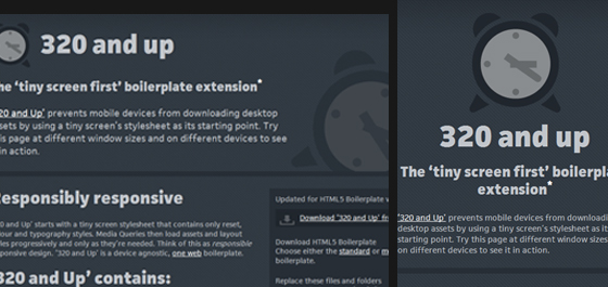
320 and up boilerplate - responsive design
The continued introduction and adoption of more an more mobile devices is what will make 2012 the year of the responsive web site. Web designers and developers will move to the use of fluid layouts instead fixed width, and media queries will find they’re way into many more stylesheets – allowing more sites to easily be viewed across multiple screens sizes and devices.

2. Fixed-Position Navigation

We have all run into this technique at some point, mostly on personal websites or individual blogs. I have seen a large drop in this trend during 2010-2011, but a resurgence has been appearing over the last few months.
If your website doesn’t have a lot of main navigation then you only need to provide a few small links. So why not keep these visible to each user at all times? This can dramatically improve website performance and even blend into the overall page layout with ease. The concept idea is to keep the navbar and internal links/logo locked in place as your visitors scroll through the content.
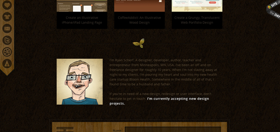
Ryan Scherf main portfolio page
jQuery has allowed for very rapid prototyping of this effect. And even without JavaScript enabled you can apply some fancy CSS code to replicate the sticky nav effect. Most of the static navigation bars in 2011 have followed the user’s movement around from page to page. Yet in the example below Simon Wuyts has taken fixed navigation into a new level.
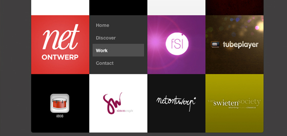
net onwerp web design - fixed position menu
You never consider keeping your webpage content set into a slideshow-like panel for easy display. Not only does this remove the worry of screen resolution, but the navigation system is easy to work with and carries over nicely into mobile browsers. You may seriously consider this technique and all the major benefits during a 2012 site layout re-design.

3. Circles

This trend has actually been noticeable in web design for a bit, yet it recently had died down to lay low for a couple years. During the web 2.0 boom designers were focusing more on desktop-based trends such as drop shadows and rounded corners. But with CSS3 it’s now easier than ever to create these fancy box effects.
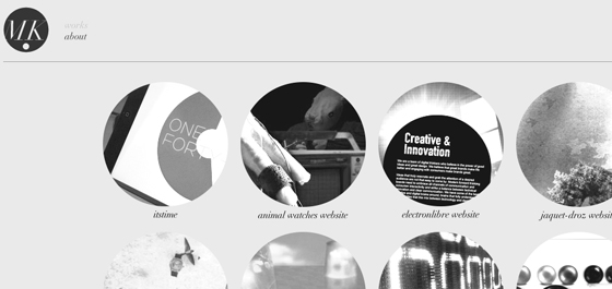
Additionally you can design circles and shapes without the need for any images. The impact of these features has caused designers to look at photos in another light entirely. I constantly check out portfolios for web designers and have noticed a dramatic increase in circular-shaped elements. These archetypes can be setup as navigation links, footer icons, or even displaying important portfolio works as seen below.
Mickael Larcheveque personal portfolio website
But the most extreme examples aren’t always the best. Circular shapes are smooth and encourage eye contact from your visitors. Use these to single out specific areas in your design such as listings to helpful resources and pages. Just the shape itself is pleasing enough to be dropped into the background and still hold a delightful effect.
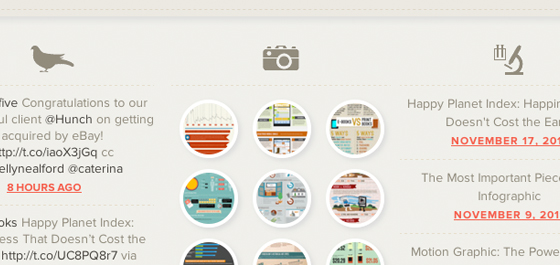
Column Five Media footer area

4. Big Vector Art

The goofy oversized mascots you can spot throughout websites have begun to claim a brand of their own. Just a few years ago you could not find very much illustration work tied into web branding. But the quality of individual designer’s talent has improved greatly. And I can think of no better marketing brand than a lovable vector-based creature.
mailman vector art for Thunderbird software
The many faces attributed to Mozilla and Firefox are just the tip of the iceberg. MailChimp is another great example which has set the bar higher than ever before. The infamous mailman monkey is featured all throughout the website and also throughout their iOS and Android apps.
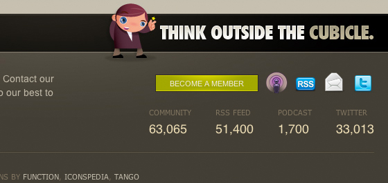
Freelance Switch freelancers design blog
Additionally the small businessman found throughout Freelance Switch really sticks in my mind. There are a slew of unique vector dudes to be found in their layout. This kind of practice has adapted into a whole new realm of website aesthetics. And if the year 2011 has shown anything it’s that 2012 will be chock-full of these adorable vector logos!

5. Multi-Column Menus

Contrary to our previous example, there are times when a website consists of way too many links to handle. Reasonably the standard type of navigation gets too messy and congested unless you move links into the sidebar. But user experience testing has shown very good results in keeping core links towards the top of pages.
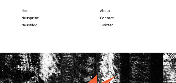
Neuarmy multi-column nav menu
This new year of trends offers designers a new chance at rebuilding. Ideas are often so black and white, but there is a whole realm of creativity waiting to be tapped into. Multi-column layouts are elegantly brilliant in their own regard. You can easily display numerous links to your visitors and keep this section fitted squarely around your logo.
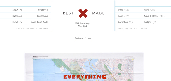
Best Made Company home webpage
The best way to get comfortable with this style is practice. Check out some recent articles on the topic to educate yourself about trends in web navigation. Designers are eagerly jumping into the testing arena with new ideas every year. Clearly the reform of standard navigation is a big one on everybody’s plate.

6. jQuery/CSS3/HTML5 Animation

I have always recommended jQuery effects when applied in small portions. Web design must encompass the whole user experience as well as fancy aesthetics and bonus animations. Luckily advances in the jQuery library as well as CSS3 specifications allow for some really outstanding effects with much fewer lines of code than ever before.
In just this past year alone I have run into some educational tutorials to be found all over the web. jQuery is the master of frontend browser effects but unfortunately doesn’t boast 100% major support. Thus using a fallback method tied into CSS means your website is compatible with mostly all visitors and still provides an exceptional experience. I can only imagine what developers are planning for new ideas to roll out as we move closer into 2012.

7. Ribbons & Banner Graphics

This is one design element which I had begun noticing a lot more in 2011. Designers began to write simplified tutorials for creating page ribbons, banners, bookmarks, or other types of display badges. Because of the massive emergence of free information more designers have begun jumping into the trends, too.
Letter Learner App for iPhone and iPad
You would be surprised how many websites have included this style of design in just 6 short months. Beta testers often use these ribbons to classify the current release version of software and mobile apps. Additionally you’ll find banners wrapped around free downloads or featured articles in blogs. I’ve collected a few of my favorite ribbon PSD downloads below, so check them out and be sure to keep your eyes peeled for additional freebies in the coming months.

8. Custom Font Faces

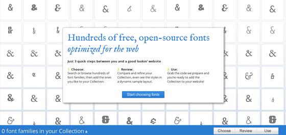
The free online font library Typekit provides a free trial for any interested web designers. With this tool you embed a bit of JavaScript which allows you to write any custom font into CSS styles. In 2011 this trend has shot up in popularity, especially among WordPress designers trying to keep their blogs unique from the rest.
Typekit was however a buggy system with very little support up until a few years ago. Now Google Web Fonts has been giving them a run for their money, and it appears to be more popular than ever! You simply go through a library of supported fonts and Google will output the code you need to include. Then you simply reference each font by name when declaring CSS font-family properties on an HTML element.
Google Web Fonts - Dynamic CSS Typography
What I find so exciting about this trend is how recently it has shot into the mainstream. It seems now even developers are creating free plugins to make custom fonts just that much easier to install. There is no uploading of fonts required, no stress involved and very little to go wrong. Bloggers should take notice of this and check out some of the alternative fonts available to them.

9. Infographics

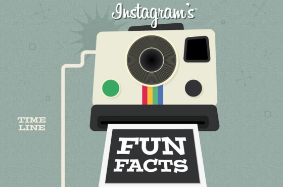
This trend certainly doesn’t affect the overall web design, but as for user experience and content presentation infographics have blown the roof off new-age media. Never before has information been presented in such an easy-to-consume manner. Even if you barely understand the topic most infographics provide data, charts, and supporting imagery so that a 5 year old child could follow along.
Instagram infographic fun facts
Depending on the type of website you may find this trend not all too useful. It can take a lot of practice and time spent slaving away in Photoshop to perfect these works of art. Yet if you have the talent ordrive to teach yourself I say go for it! Now more than ever before the Internet has become a place we can all gather and share information. Infographics have expedited this process using the World Wide Web as a presentation medium.

10. Focus on Simplicity

Ultimately the goal of any website is to get your visitors from point A to B as quickly as possible. Simple, intuitive interfaces are the way of our future. In just the past 5 years I have noticed most of the popular design trends stemming from minimalism. This idea is not ill-founded, as the lesser number of page elements to distract visitors will naturally keep them focused on their goal(s).
We can provide so many examples of this, and there are so many areas to cover. Earlier this May we covered a fine gallery of minimalist websites which pose as examples to perfection. Depending on the type of website you have there may be too many required interface pieces to coordinate a simplistic overtone.
Evening sunset over Japanese Houses
But to rearrange a layout into a clean setup doesn’t require minimalism at the heart of it all. Spend some time writing and drafting out ideas for your navigation, page hierarchy, headings, content area etc. I find that a little bit of pre-planning can go a long way towards simplifying everything.

Conclusion

These design trends are just some of the few to keep up with as we move forwards into 2012. The year is unpredictable and nobody can say for sure what to expect. I think the facts are obvious that your average web designer has been learning much quicker in recent years than ever before in history. As such we could only expect plenty of innovation and new semantics ushering us into a golden age of technology and massive Internet awareness.

Jake Rocheleau is a social media enthusiast and Internet entrepreneur. He can be followed on twitter - @jakerocheleau His presence on the web can be found atJakeRocheleau.com.

Web Design Trends in 2011

Tuesday, 13 December 2011

HTML5 Essentials and Good Practices

Powerful Web Forms. Zero Coding. Adobe Business Catalyst.


HTML5, together with CSS3 and responsive design are the new buzz around web technologies these days. This article will help you get started using HTML5 on your projects today and show you some good practices to put what you learned to good use.

HTML5 Logo
Lets see a typical HTML5 page markup:
<!doctype html>
<html>
<head>
   <title></title>
</head>
<body>
   <header>
       <h1></h1>
       <nav>
           <ul>
               <li><a href="#">link 1</a></li>
               <li><a href="#">link 2</a></li>
               <li><a href="#">link 3</a></li>
           </ul>
       </nav>
   </header>

   <section>
       <article>
           <hgroup>
               <h1>Post title</h1>
               <h2>Subtitle and info</h2>
           </hgroup>
           <p>Content goes here.</p>
       </article>
       <article>
           <!-- Another article here -->
       </article>
   </section>
   <aside>
       <!-- Sidebar here -->
   </aside>
   <footer></footer>
</body>
</html>
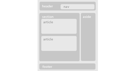
With some styling the structure of our page will be like the image below
HTML5 Logo

Doctype

If you come from an HTML 4 or XHTML background, the first thing you might have noticed on the sample markup above, is the new doctype declaration. Really simple, just type it as you see it. And no reasons to worry, it is backwards compatible with all browsers. You can actually change it right now on all your html pages.
Apart from the new simple doctype declaration, you will see many new tags. Most of them are pretty much self explanatory but lets see them in detail.

Block level Elements

In HTML5 we no longer have to resort to “div-itis” to give structure to our page. We have a great selection of new block level elements that help us to create a semantic structure quickly and of course our code becomes more readable and maintainable.
With the new structural elements we can begin to forget about <div id=”header”> and <div id=”footer”> and start using the new <header> and <footer> tags. They work the same as a div but hey, less writing, more semantic code. We are also introduced to other new elements such as <section> <article> <nav> <aside> <hgroup> <figure> and <figcaption>.
The use of <header> and <footer> is obvious. The <nav> tag specifies the navigation links of our page instead of having <div id=”navigation”>. <aside> refers to a section of the page that is separated from the main content. It is mostly used for sidebars today, though some developers suggest it could be used to contain some secondary information for example, for articles.
<section> is used to give structure to our page and contain parts related to a certain theme while <article> can contain a blog post, news post, comment etc. A <section> can contain many <article> elements and an <article> element can contain many <section> elements.
We also have a new container for our headings <h1> to <h6> which is the <hgroup>. Finally we have a <figure> element which is container for a representational image, related to the content but its presence is not mandatory. The <figure> element can also contain a caption using the <figcaption> element.

Inline Elements

HTML5 introduces some new inline elements too. <time> and <mark> are a couple of these new ones that help to make our markup even more semantic.
<time> is used to display time semantically. You can choose to display time, date and both. Example below
<time datetime=”20:00”>8pm</time>
<mark> is used to highlight parts of content for example when a user searches for a specific term. Its difference from <strong> or <em> is that it gives no special meaning or importance to the content it highlights.

Media Elements

HTML5 also brings us some new media elements. We have <audio>, <video> and <embed> tags together with the <source> tag to specify media sources. The simplest way to use them is below
<!-- simple audio use -->
<audio src="audio-file.ogg" controls>
</audio>

<!-- simple video use with multiple sources-->
<video controls>
   <source src="video-file.mp4" type="video/mp4"/>
   <source src="video-file.ogv" type="video/ogg"/>
</video>
Unfortunately, support is not so great yet. Browser makers chose different filetypes and encoding for the sources they support so you have to use multiple versions of the same media with different encoding and you need a flash fallback to support even older browsers.

Canvas Element

One of the other great new features HTML5 has to offer, is the <canvas> element. It gives you the ability to draw shapes dynamically or even manipulate images. <canvas> by itself provides vast possibilities in modern web design and development but it is not a matter to discuss in this article.

Good Practices

With all those new elements some people are bound to get confused. Should we use a header inside an article to contain all the title info? Should we wrap every heading with an <hgroup>? To help you out, here are some good practices about these new elements.
The less is more motto stands in HTML5 markup too. For example when you have a single <h1> heading in your <article>, there is no need to wrap it with an <hgroup> tag. If you have two or more headings, then wrapping both of them with an <hgroup> would be a good use of the <hgroup> element.
<!-- incorrect use of hgroup -->
<article>
    <hgroup>
        <h1>Heading</h1>
    </hgroup>
    <!-- rest of content here -->
</article>

<!-- correct use of hgroup -->
<article>
    <hgroup>
        <h1>Heading 1</h1>
        <h2>Heading 2</h2>
        <h3>Heading 3</h3>
    </hgroup>
    <!-- rest of content here -->
</article>
Do you really need to have a <header> and a <footer> element on your <article>? Depends. Do you have many info regarding the article like multiple headings, date information, comment information etc? Then the <header> would have semantic meaning and would be used correctly. Again refrain in using too many elements when they are really not needed. No need to nest a single <h1> in a <header>. Same goes for the <footer> element. Do you have post information, author information etc? Then a <footer> would be appropriate.
<!-- incorrect use of header -->
<article>
    <header>
        <h1>Heading</h1>
    </header>
    <!-- rest of content here -->
</article>

<!-- correct use of header -->
<article>
    <header>
        <hgroup>
            <h1>Heading 1</h1>
            <h2>Heading 2</h2>
        </hgroup>
        <p>Date and Author information</p>
    </header>
    <!-- rest of content here -->
</article>
Should you use <section> or <article>? There really is only one way to tell whether you should use one of these elements. <section> refers to a structure that contains related content. <article> on the other side, contains independent content. So a <section> can have many <article>s and an <article> can have many <section>s. It all gets down to what the content is.
Do you use <aside> only for a sidebar structure? <aside> started out that way, but the specs have changed since then. Nowadays <aside> gets another semantic meaning when used inside an <article>. It denotes secondary content related of course to the main content inside the <article>. When used outside of an <article> it is still considered secondary content but for the page as a whole, sidebars being a perfect example.
<!-- aside outside of article -->
<div>
    <aside>
        <!-- use as sidebar for example -->
    </aside>
</div>

<!-- aside inside of article -->
<article>
    <!-- main article content here -->
    <aside>
        <!-- secondary related content -->
    </aside>
</article>

Browser support

Support is great for most of the new HTML5 tags, especially the block level ones. All you have to do to enable all the modern browsers to understand them, is to include the code below in you css file.
article, aside, figcaption, figure, footer, header, hgroup, nav, section
{
    display: block;
}
For IE, this is, of course, not enough. Still all you need to do, is include the html5shiv script when the page load in IE. Use the code below
<!--[if lt IE 9]>
<script src="http://html5shiv.googlecode.com/svn/trunk/html5.js"></script>
<![endif]-->
And that’s pretty much it. You can start using these new HTML5 elements today and make your markup much more semantic, readable and maintainable.

About the Author


Ilias Iovis is a web and graphics designer & web developer from Thessaloniki, Greece. He is mostly interested in front-end and is constantly learning about HTML5, CSS3 and jQuery. You can find him at iliasiovis.comand follow him on @iliasiovis.
Top